The Retained — Mobile-First Test [TEST 5]
Responsive Image Test — Mobile-First
You should see the MOBILE screenshot on mobile, DESKTOP screenshot on desktop.
Material Kitchen — "Find the cutting board for you"
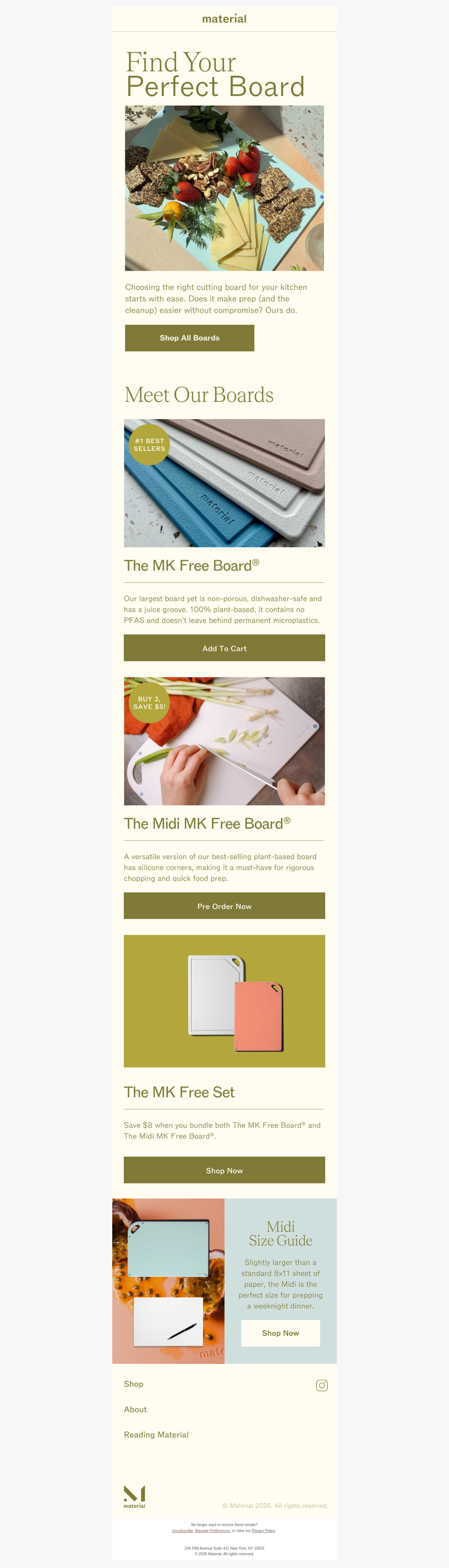

A great example of a product education email that drives discovery without hard-selling.
Alo Yoga — "Spring forward is almost here"

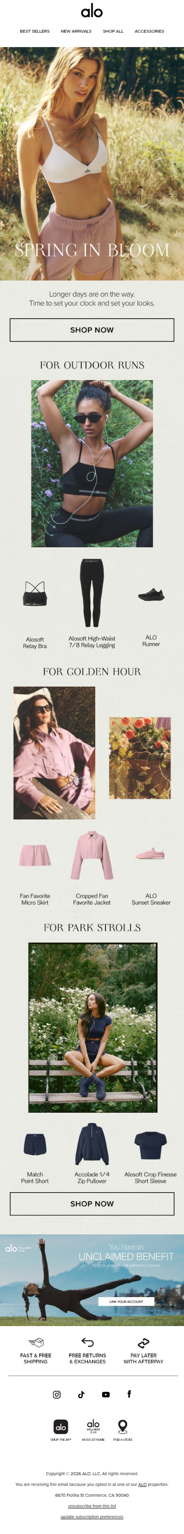
Seasonal urgency without a discount — aspirational lifestyle positioning at its finest.
TEST 5 — mobile-first default. Desktop image hidden by inline styles, revealed via min-width media query for clients that support it.
Don't miss what's next. Subscribe to The Retained: